I love to evaluate webpage design. Here's my take on Travelpod.
I use travelpod to read other people's blogs on destinations I may travel, and to learn how they did certain things, like how did their border crossing go, or was it easy to find accommodation in the forest?
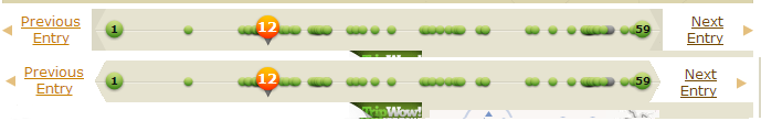
Here's the blog post Title, then the post bar which each green dot is a post you can skip to.
Here's the blog post Title, then the post bar which each green dot is a post you can skip to.

But AHH! Left side - Trip Start date falls off the bar. It doesn't look good. Also, I love the info of spacing the posts with how far they are by date but it actually gets tricky to get between them, so I'd suggest there needs to be a minimum spacing requirement before the spacing for date.
If you mouseover the Trip Start or the Trip End, they change to Previous Entry and Next Entry respecitively but they aren't consistent looking. For one it doesn't keep those angle bars, the Next Entry button is just a white rectangle overlaid.
If you mouseover the Trip Start or the Trip End, they change to Previous Entry and Next Entry respecitively but they aren't consistent looking. For one it doesn't keep those angle bars, the Next Entry button is just a white rectangle overlaid.
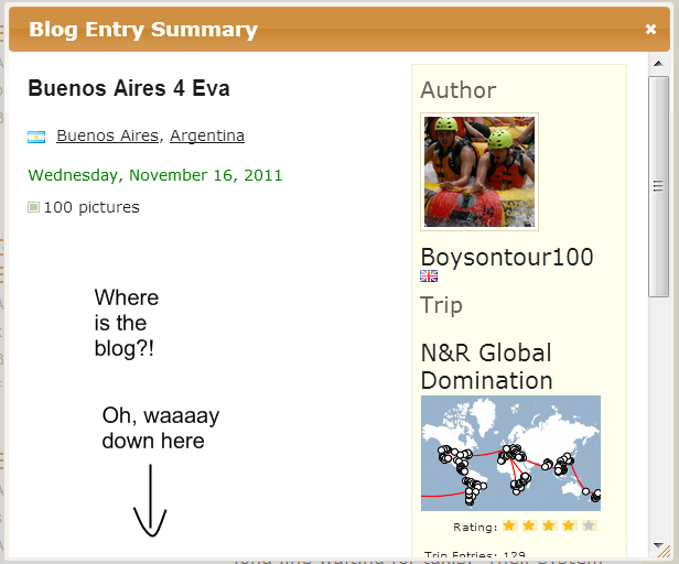
Next Beef: Blog Summary popups - blog text is not aligned properly
I love to search for the destination I plan on going. So, I searched for Buenos Aires. I find a list of entries for that location. I click on the blog. A blog Summary pops up. Fine - except the alignment is wrong and no blog text appears -- the blog text appears after the right side box of Author info.